Projects/nanameue
Overview
Brand Identity Brand Identity
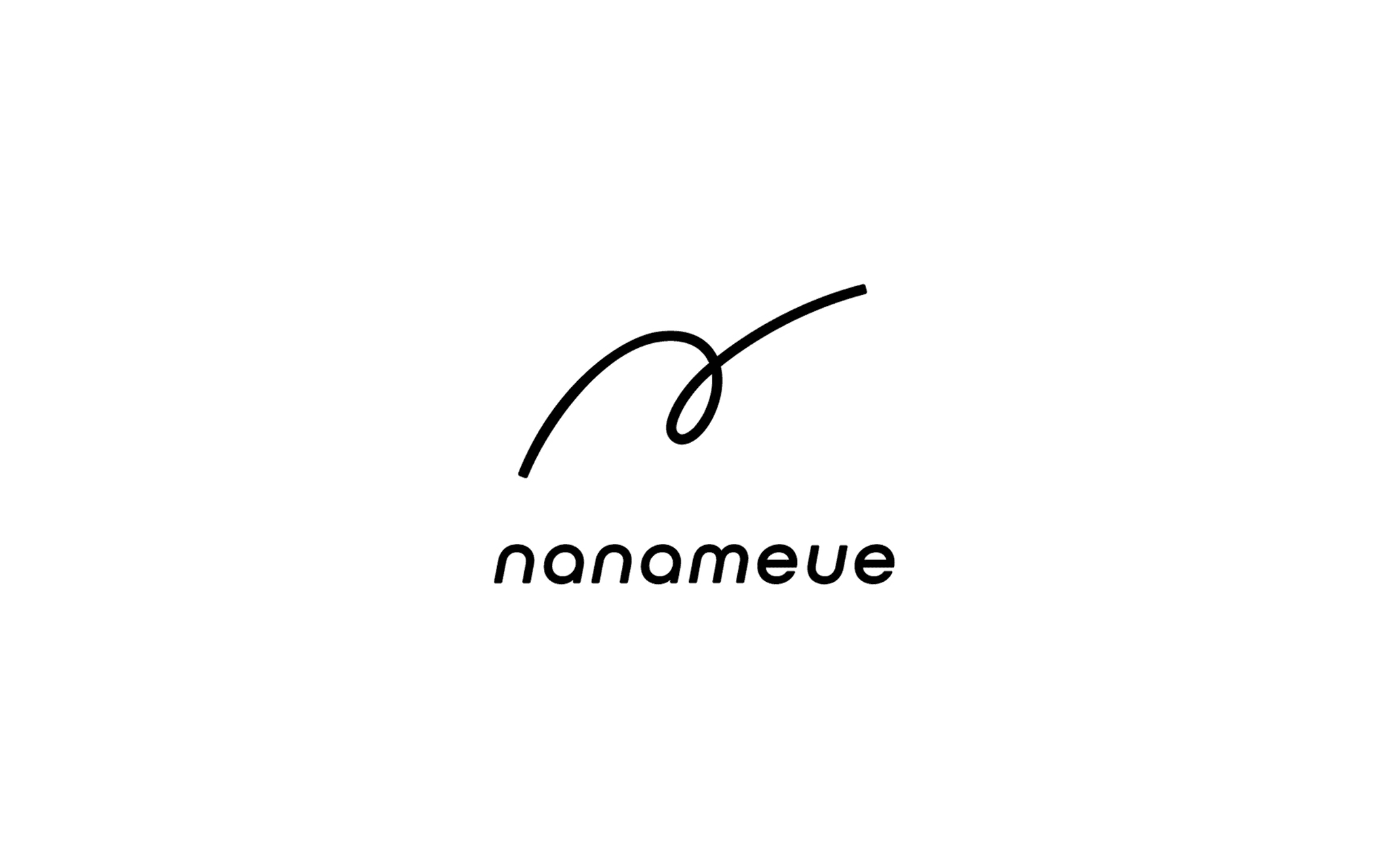
The name “Nanameue,” which means “upward diagonal” in Japanese, embodies the concept of unconventional thinking. It suggests approaching solutions from a unique diagonal perspective, rather than following a straight, linear path.Inspired by Nanameue’s core philosophy of “cleverly identifying key aspects and solving problems in an ‘upward diagonal’ manner,” we developed a logo that is calm and understated, complementing the surreal and powerful impression of its company name.
Exploring the Vision Behind the Logo
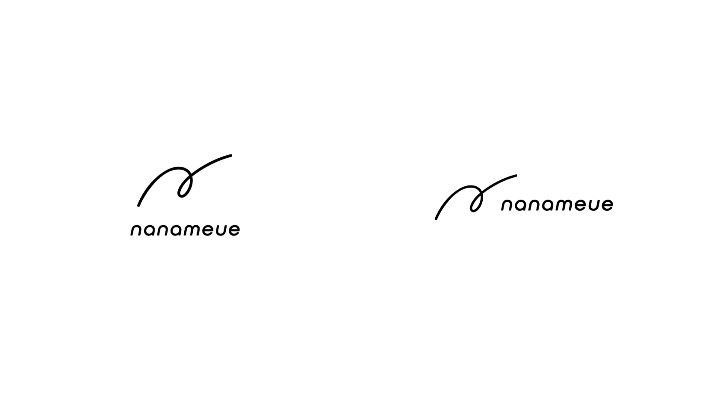
We began by generating a wide range of visual concepts inspired by the name “Nanameue.” Through multiple iterations and close collaboration with President Ishihama, we refined these ideas to align with the vision he had for the company. This process of continuous feedback and adjustment led us to a final design that both sides were satisfied with.
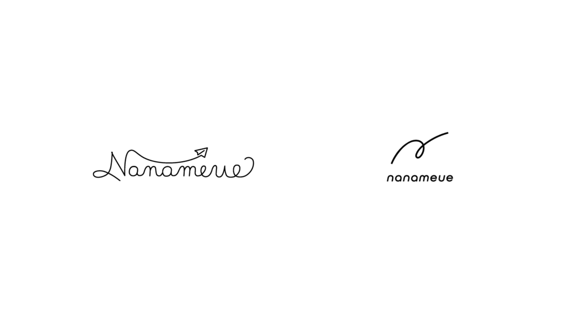
The Legacy of the Paper Airplane
The new logo retains the essence of the paper airplane’s trajectory, a motif used in the previous logo, symbolizing the company’s journey and growth. The letter “n” has been incorporated into the design, representing “the beyond present” and “the unseen future.”
The Trajectory as Identity
The upward diagonal trajectory, extending into a vast space, sparks imagination and creativity. We believe that as long as this trajectory remains central to the design, it will continue to embody the company’s identity, allowing the possibilities of what lies beyond to remain limitless.