(Menu)
In a world where genuine human connections are increasingly rare, bars present one of the few environments where rich social interactions can occur. However, many bars are often seen as intimidating or welcoming only to regulars. Dunbar seeks to change this by not only offering drinks but also creating a space that fosters community and invites everyone to connect.
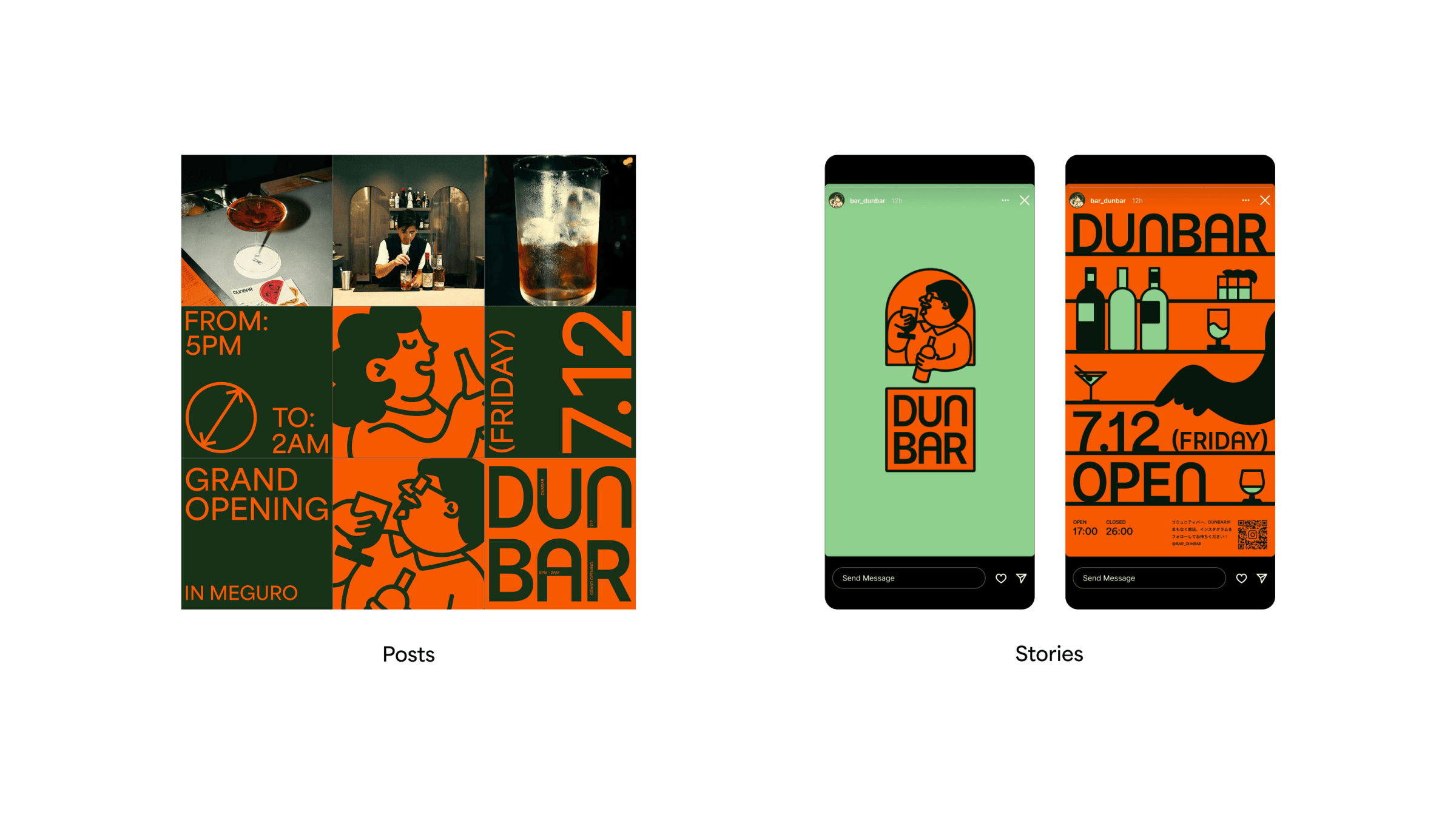
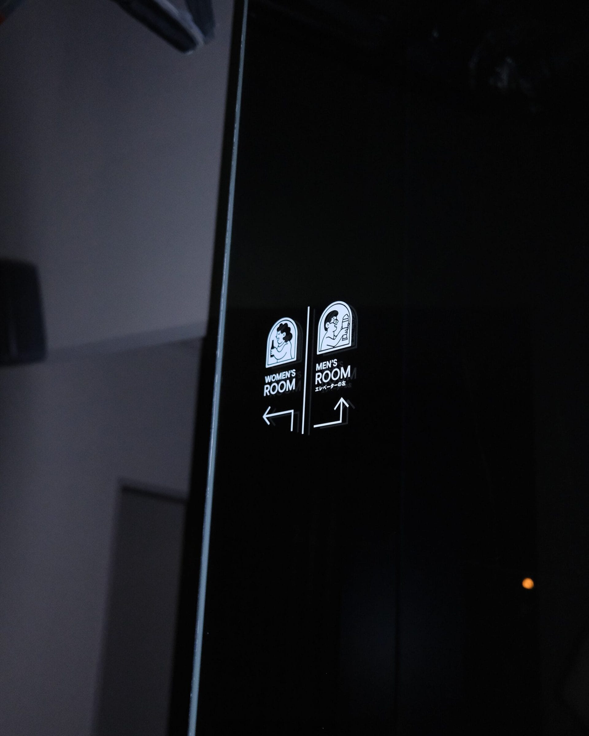
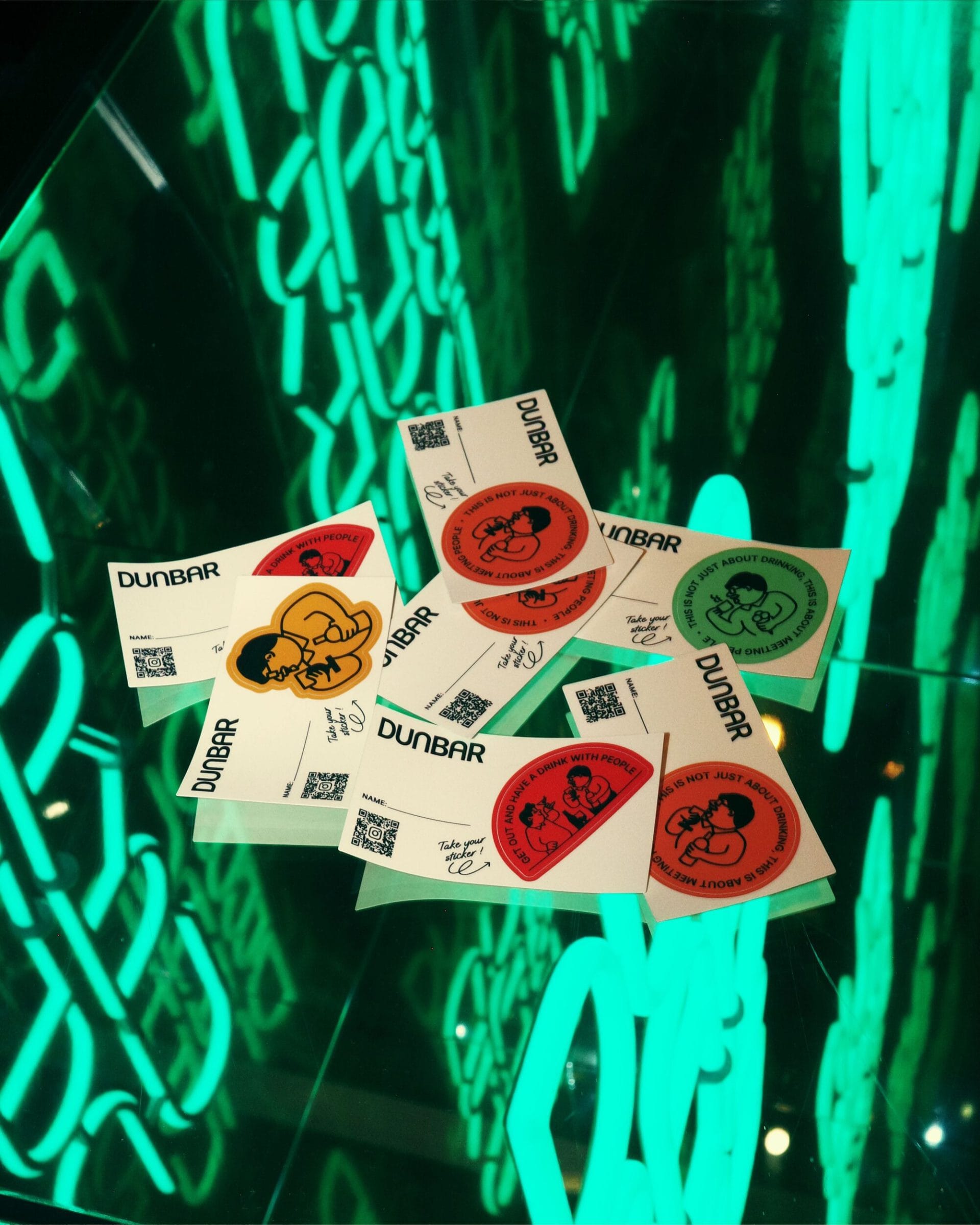
To convey openness and comfort, we designed a friendly and reassuring atmosphere. The illustration accompanying the logo features a man with a warm, intellectual demeanor, symbolizing the type of patrons Dunbar aims to attract—those seeking both relaxation and engaging conversations.
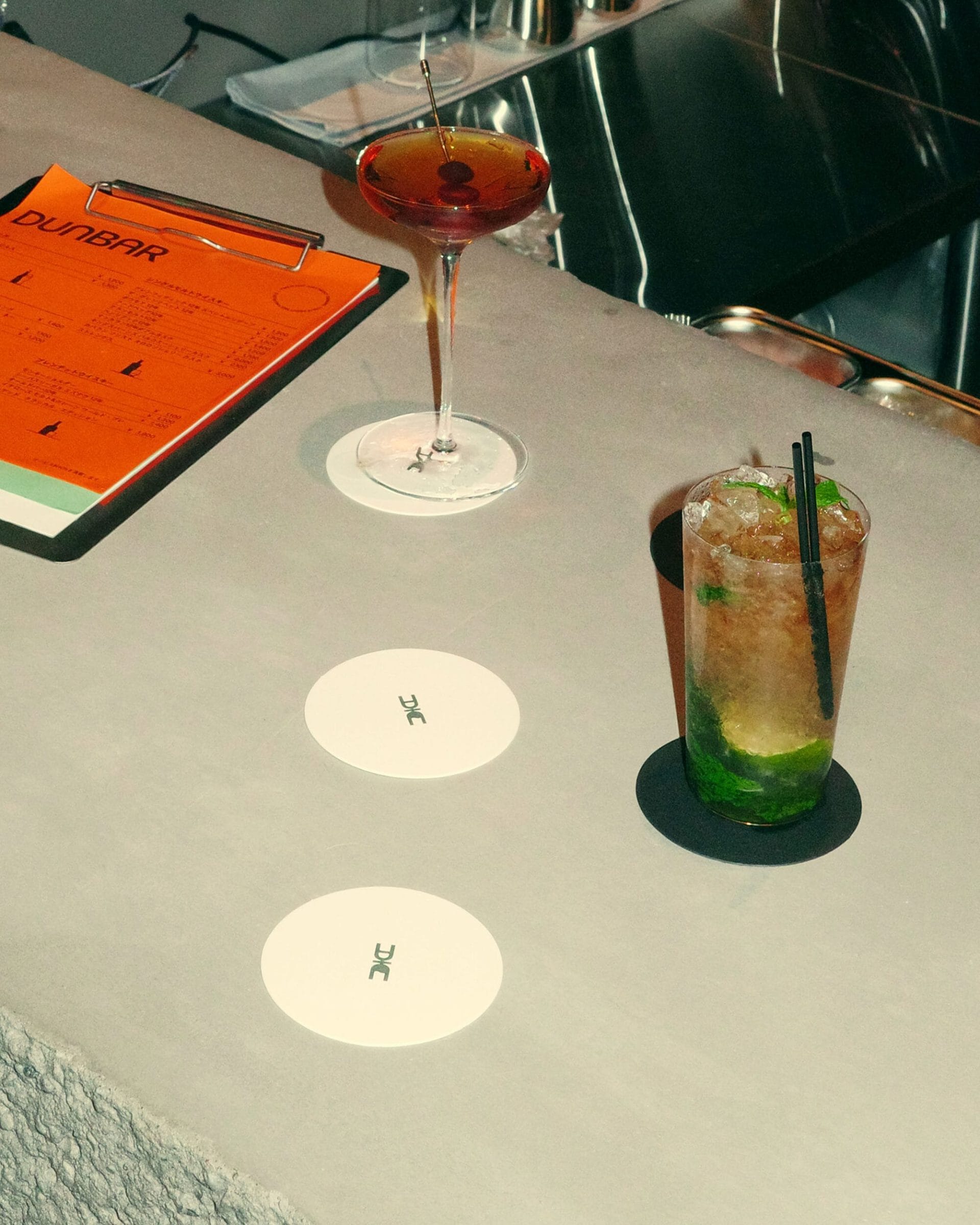
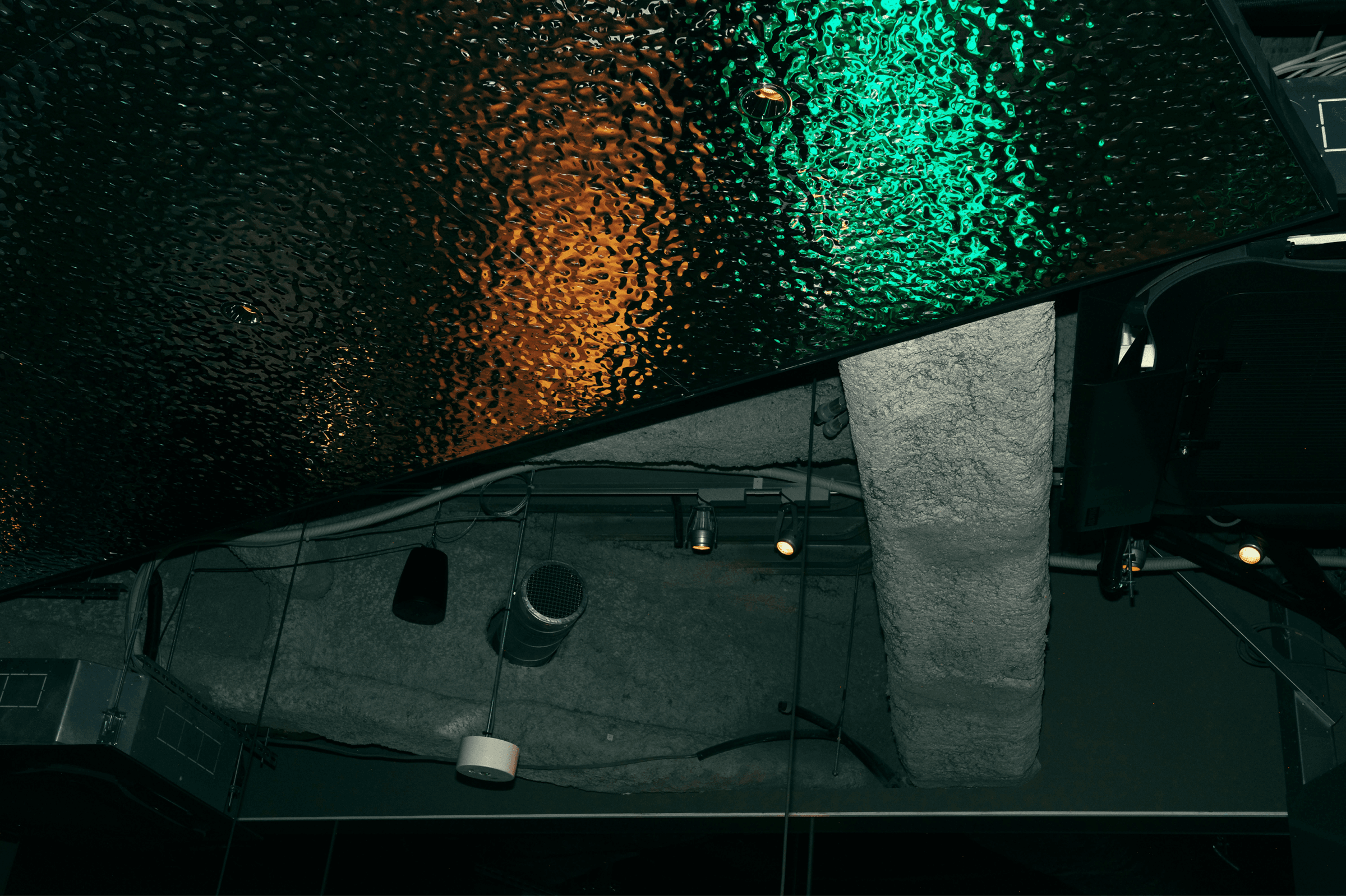
The color palette was chosen to evoke warmth and comfort. Orange represents the joy and warmth of a night out at the bar. Light green reflects the natural surroundings of the Meguro River, where the bar is located, while dark green captures the tranquility of evening and twilight. A vibrant orange, near red, was selected as an accent color to evoke the warmth of the bar’s fireplace and infuse the brand with a lively touch.

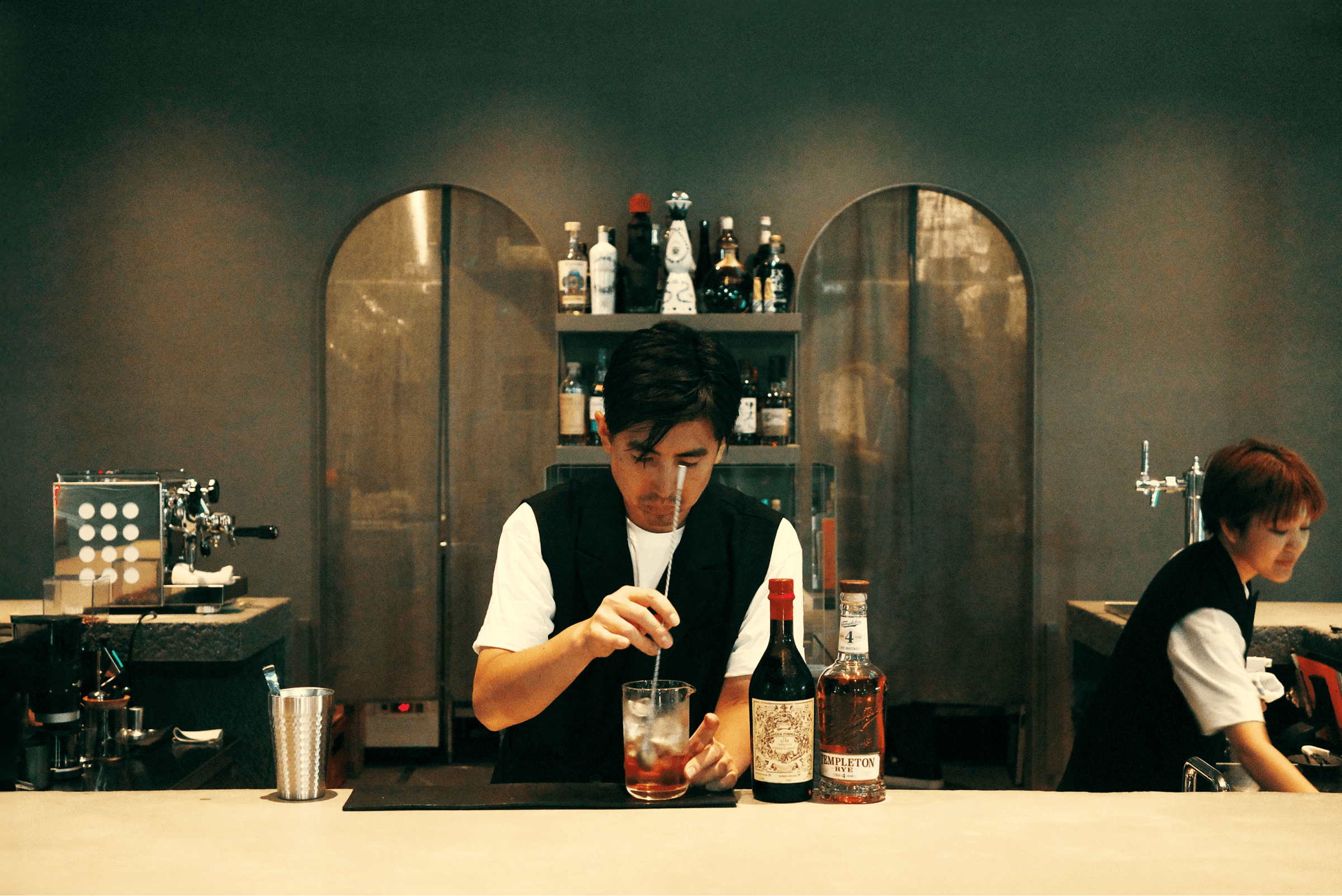
The arch shapes featured in the logo and illustrations were integrated into the bar’s interior design, creating a seamless connection between the space and the brand’s visual identity. Arch-shaped windows symbolize the excitement of meeting like-minded individuals, akin to encountering friendly neighbors. This design element is intended to make first-time visitors feel an immediate sense of familiarity and belonging.