Projects/Diverse
Overview
As Diverse transitioned to independence from its parent company, we led their rebranding efforts, which included developing a new corporate identity and visual identity and redesigning the corporate website.
Brand Identity
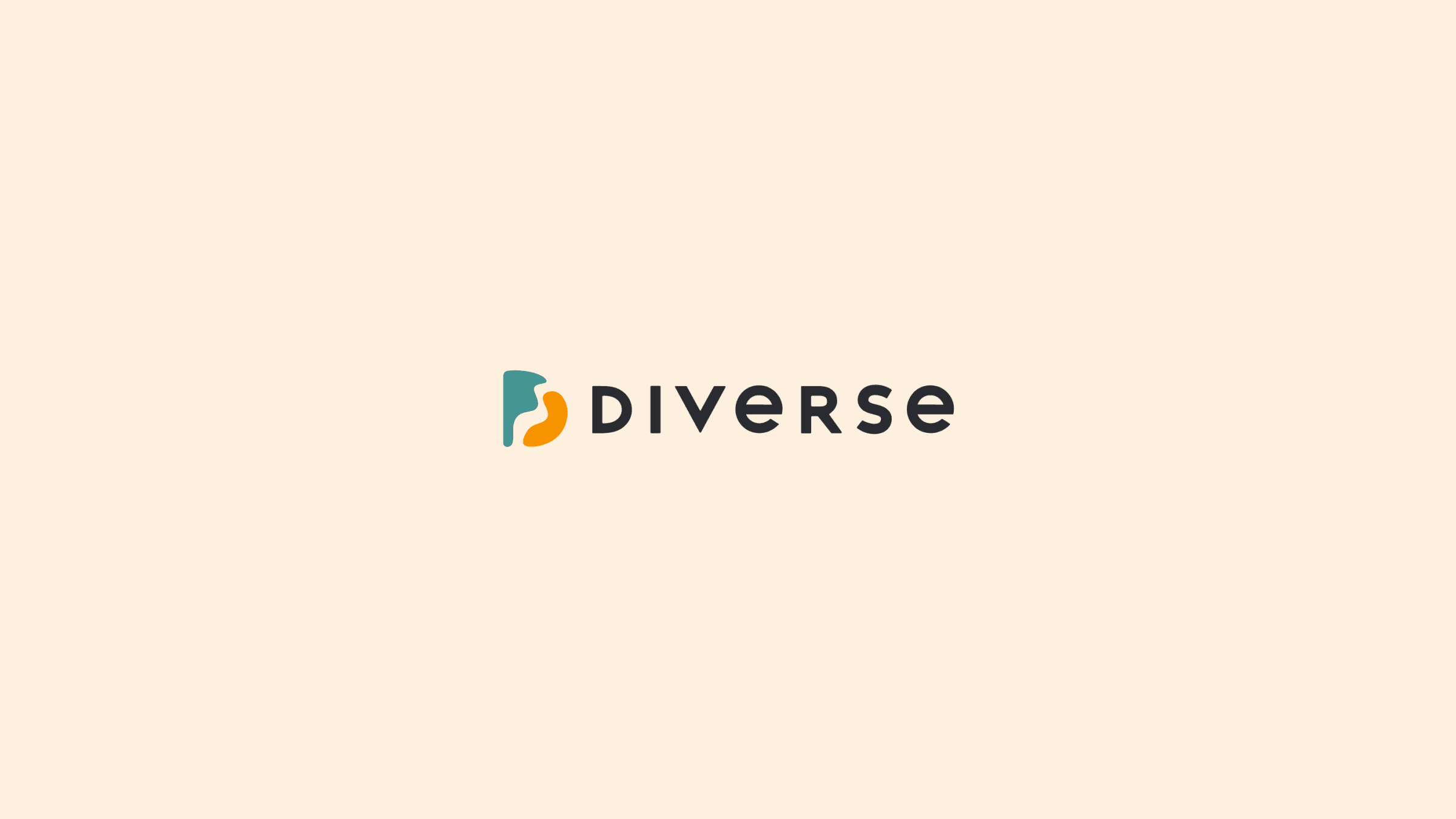
A Symbol Representing Human Connections
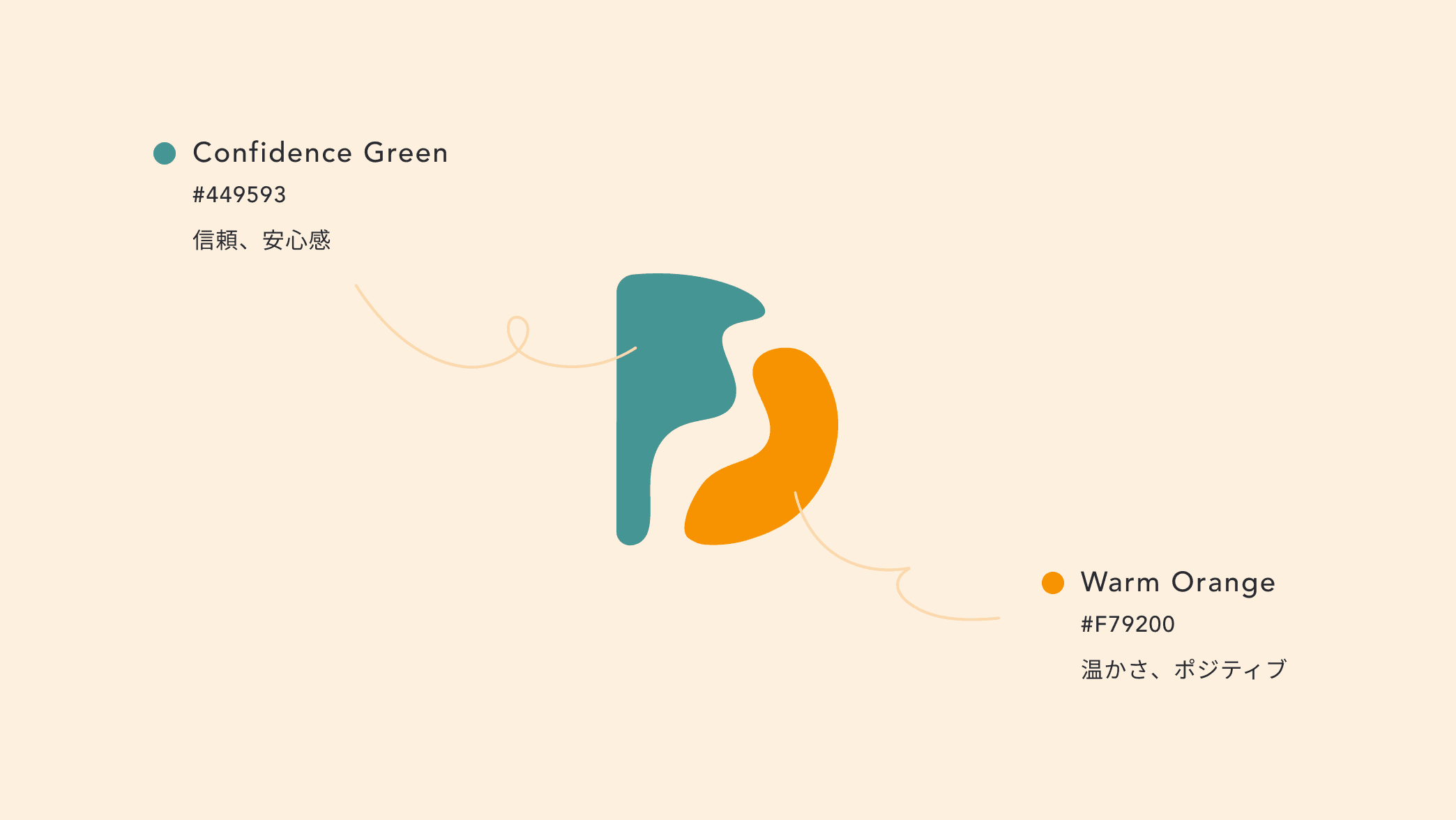
With a mission of "Fostering a society where mutual support thrives naturally,” Diverse aims to be a truly inclusive organization free from biases. For the new logo, we used organic curves to convey warmth, combined with a modern and innovative design. The logo features two interlocking puzzle pieces, symbolizing Diverse’s goal of facilitating meaningful human connections.
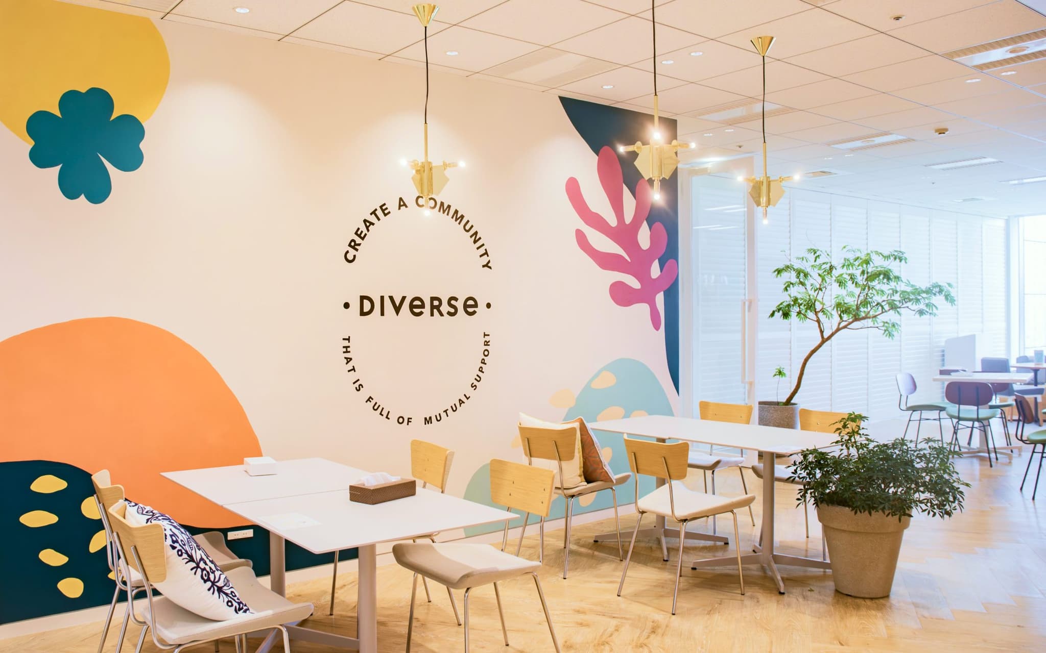
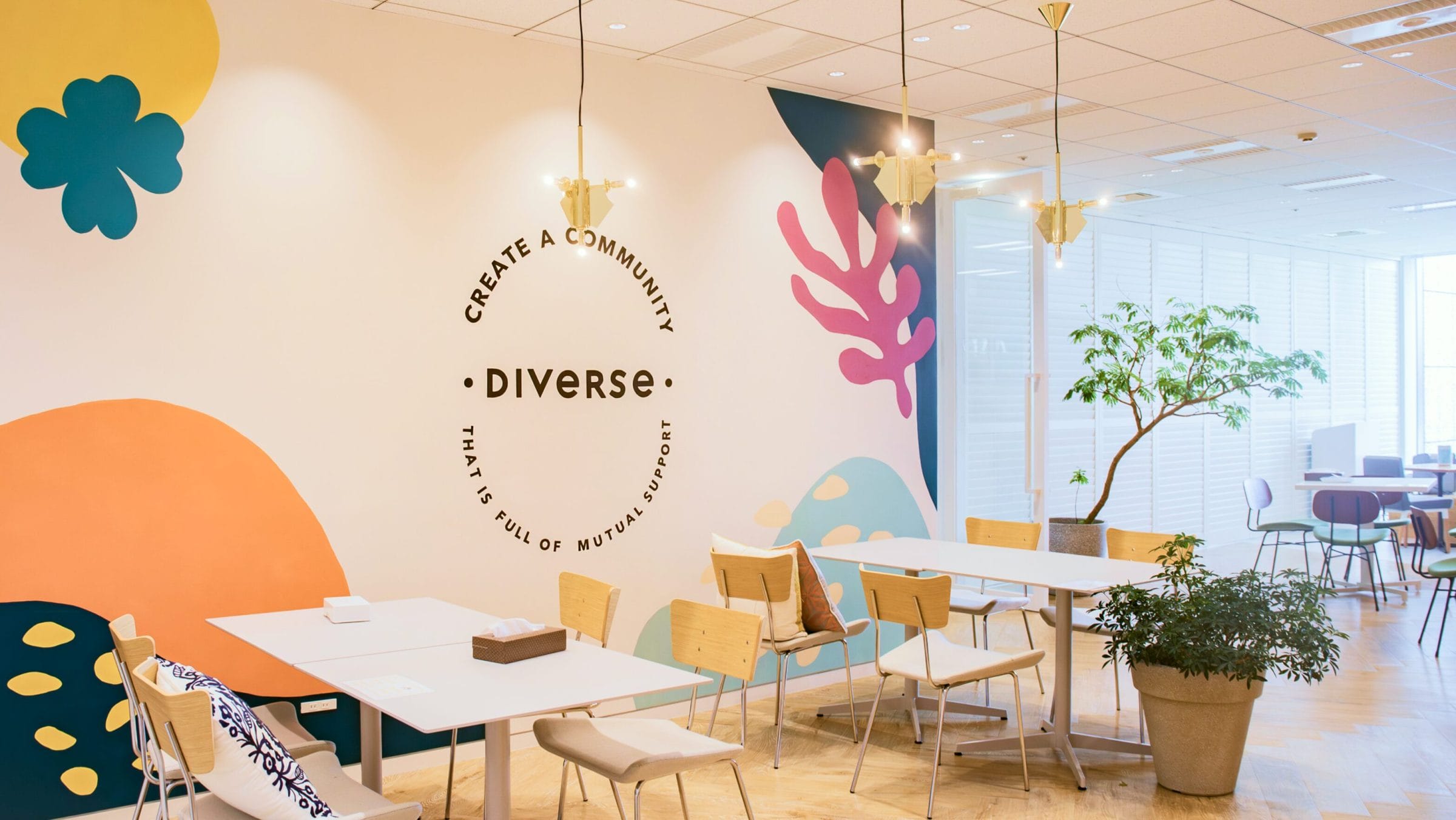
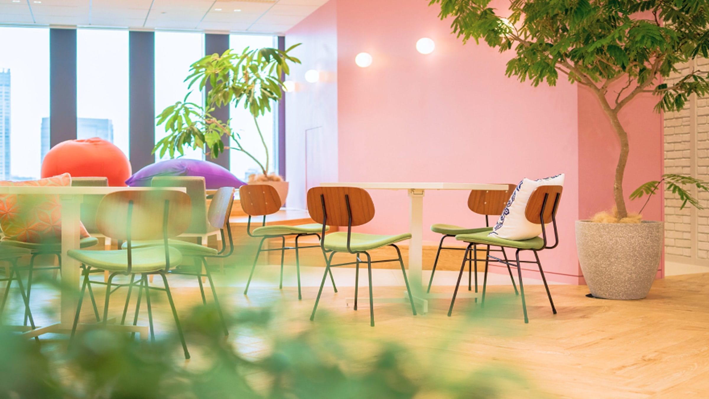
The green and yellow color scheme highlights the unity of individuals with diverse identities, underscoring the harmony that emerges from such diversity.In addition to the rebranding, we also designed the office’s interior walls and created anniversary stickers to reinforce the new identity across various touch points.
Corporate Site
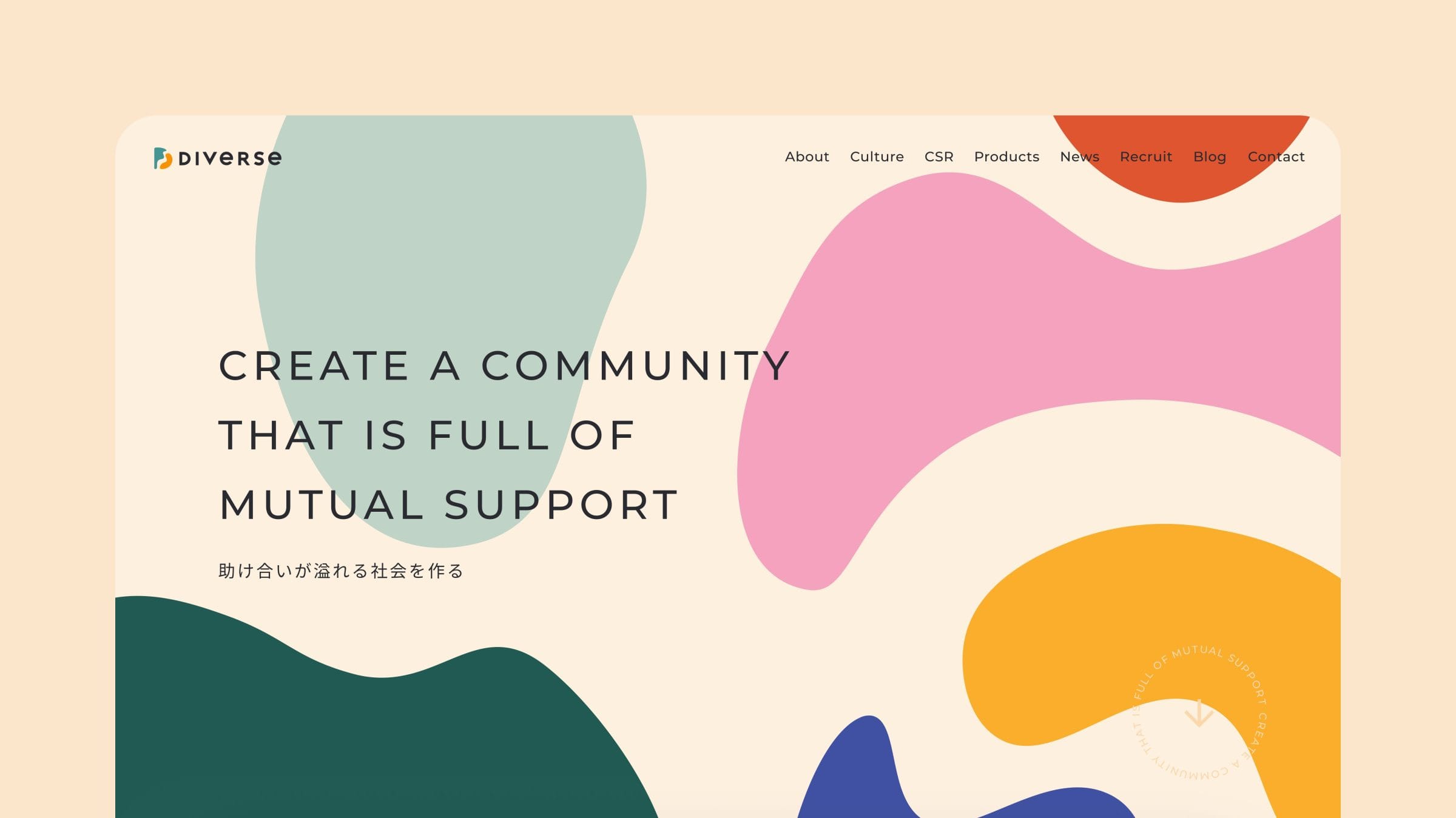
Expressing the Essence of Diverse through Organic Shapes
We represented the essence of Diverse by incorporating puzzle pieces, symbolizing “connections between people,” throughout the corporate website using various colors and shapes. The organically moving shapes, which seem to sway like living beings, further enhance the soft and playful impression that the brand conveys. Additionally, all photographic materials used on the corporate site were captured by hicard.
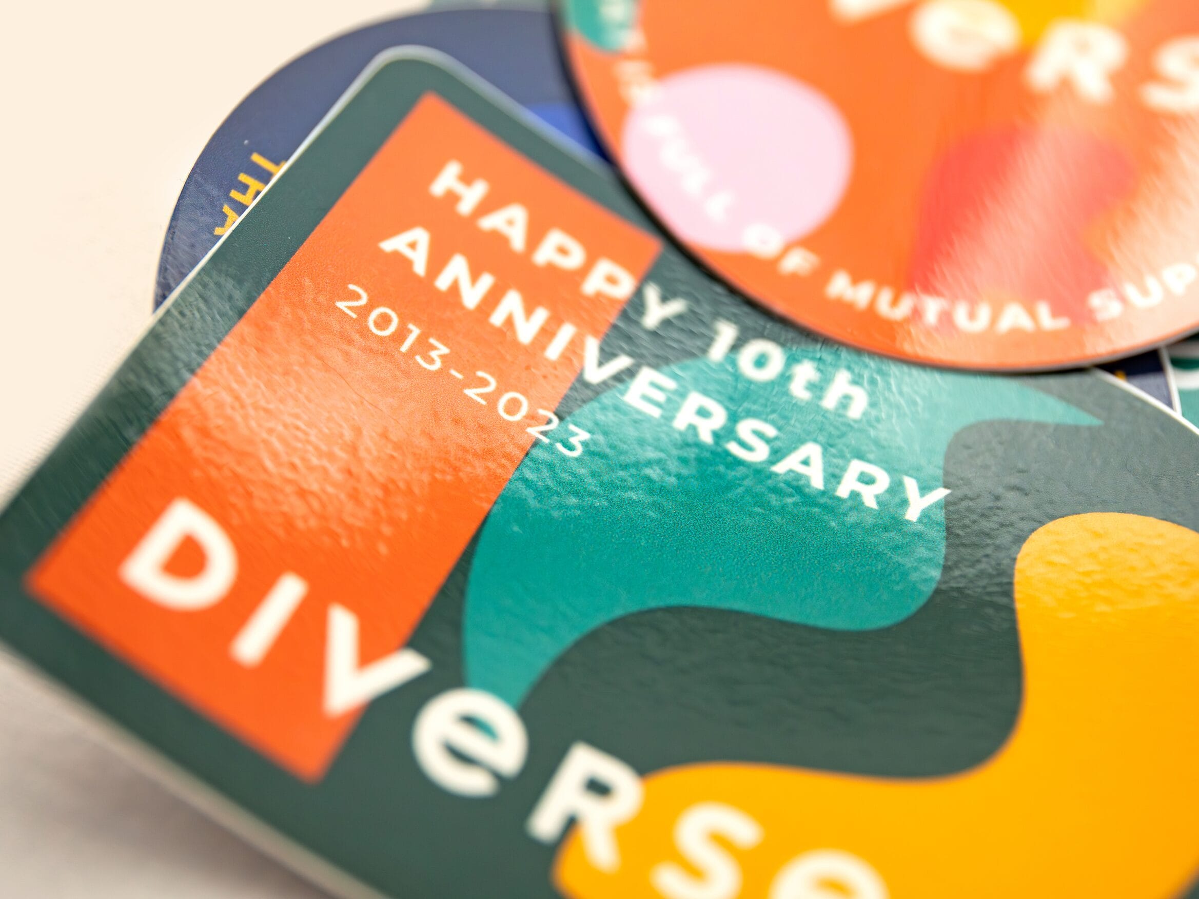
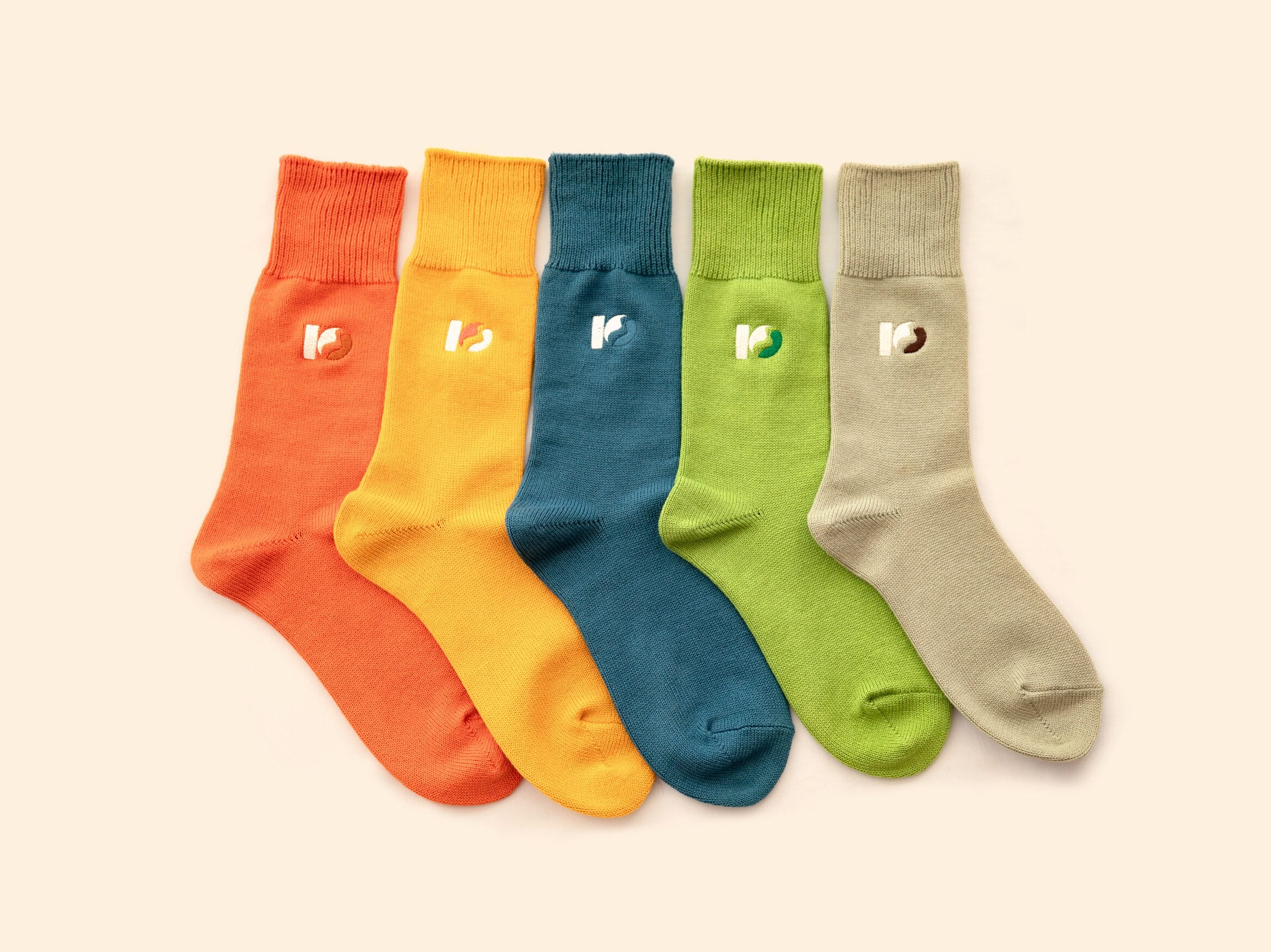
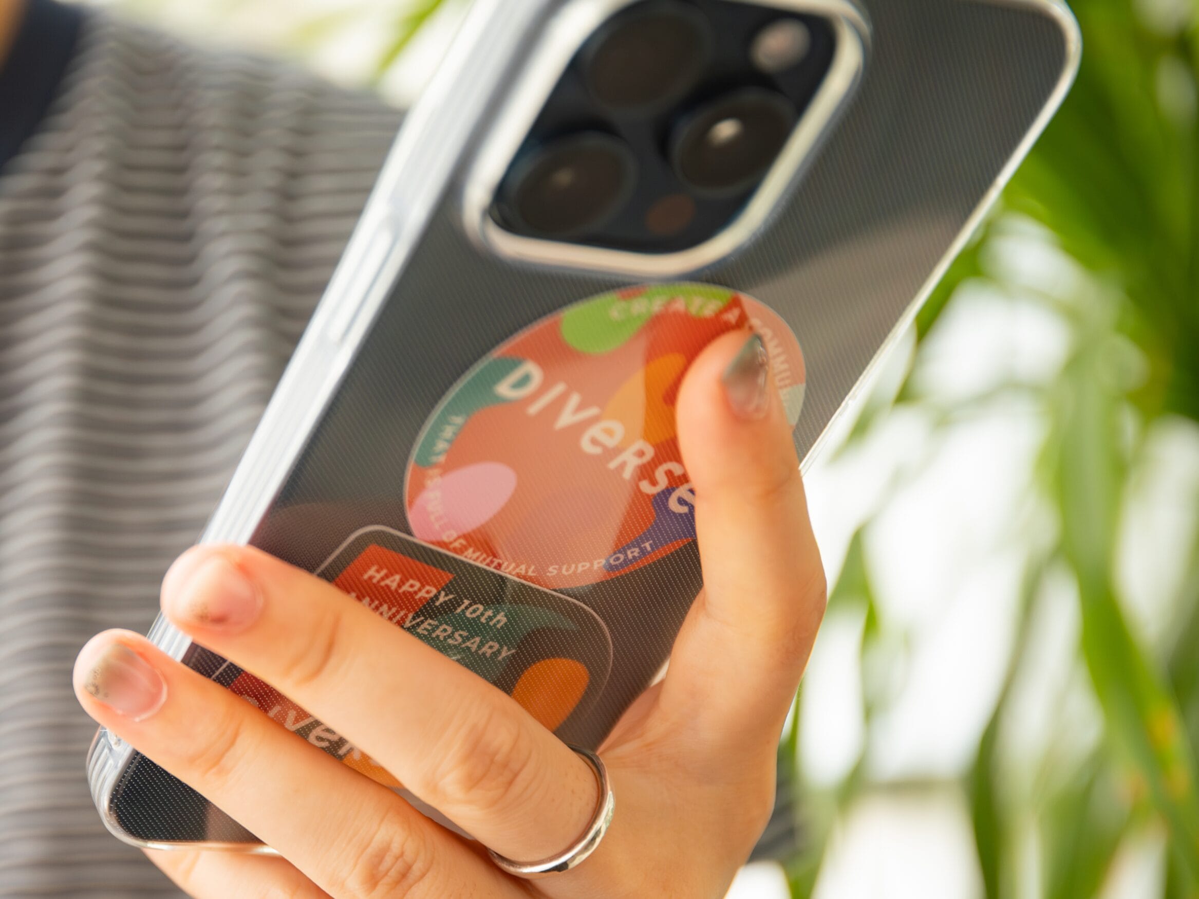
Anniversary Merchandise
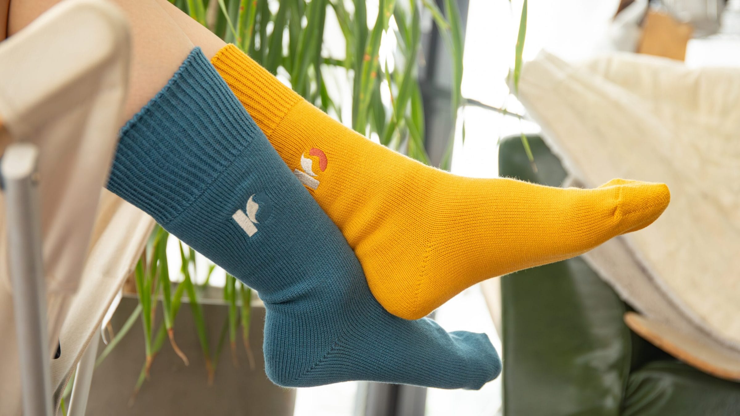
For our 10th anniversary, we made special stickers and socks. We added the Diverse 10th anniversary logo with embroidery and printing to make them colorful and unique. Our goal was to create items that our team members can use every day, helping them feel more connected to the brand.