Projects/Yugeisha
Overview

Brand Identity

Aiming for a Classical yet Modern Presence
Yugeisha’s vision is centered on “creating lasting products” and pursuing superior craftsmanship in an age of rapidly consumed content. Our rebranding efforts focused on fundamentally revising the brand to convey a humble yet elegant attitude that reflects “respect for the authors,” while preserving the classical feel of print media with a modern twist. We also considered the brand's potential expansion into physical products, such as book covers, in our design process.
A Symbol Reflecting Respect for Authors
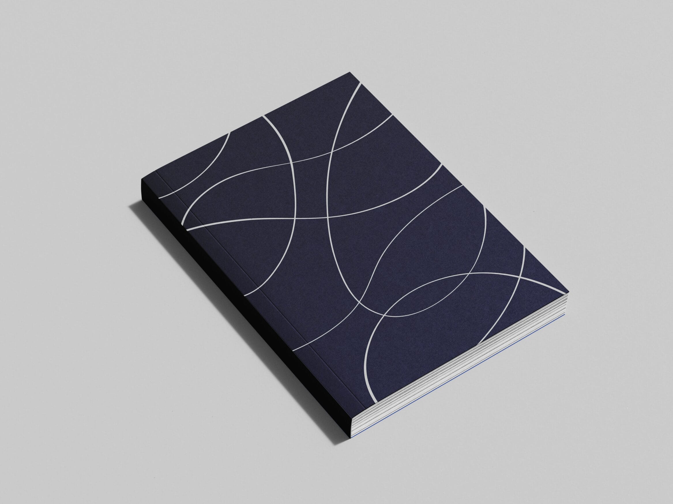
The name Yugeisha is inspired by a passage from Confucius’ *Analects*, “游於藝 (Gei ni Asobu),” which means “to enjoy knowledge freely.” Reflecting Yugeisha’s emphasis on “respect for the authors” and this origin, we conceived the idea of using “traces of a brush” as a central motif. These brushstrokes, representing the creative process, evoke a sense of artistic reverence. By framing the brushstrokes as a symbol, we visually expressed our respect for the authors.
The overlapping brushstrokes, reminiscent of ripples on water, symbolize the collective thoughts of the creators. This symbol represents the collaborative effort of a united creative team.
The symbol’s proportions follow the silver ratio—a proportion long regarded in Japan as inherently beautiful. For the logotype, we chose Yu Mincho for its affinity with the company name. Applying a subtle heitai—a vertical reduction that gently flattens the forms—conveys stability with supple strength. For the Latin letterforms, we opened the letterspacing to achieve a calm, quiet refinement.
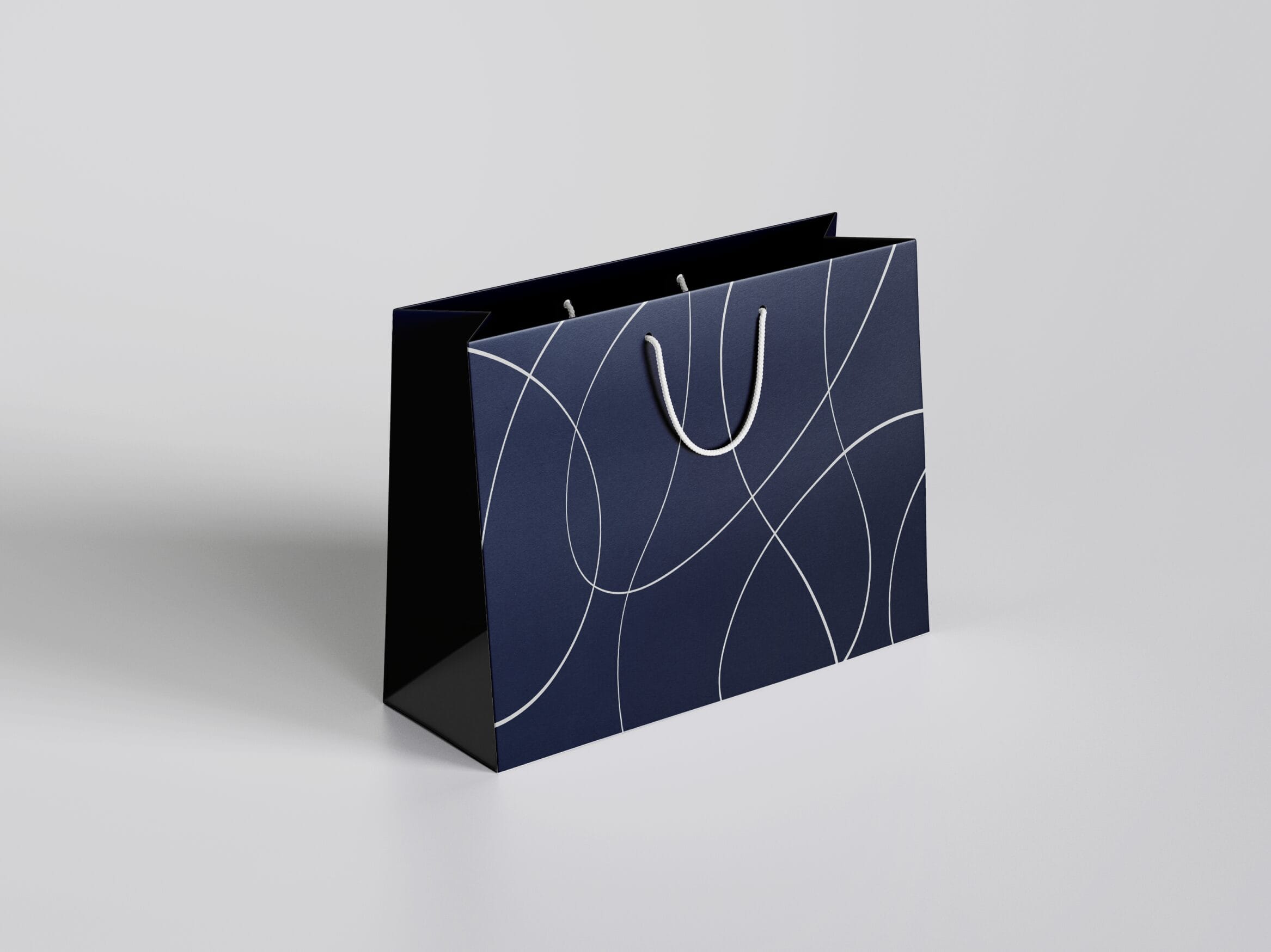
We prepared multiple layout and color variations for the logo with deployment across diverse media in mind.


We developed multiple layouts and color variations for the logo, ensuring their versatility across various media. We also provided visual representations to demonstrate how these variations would be applied.
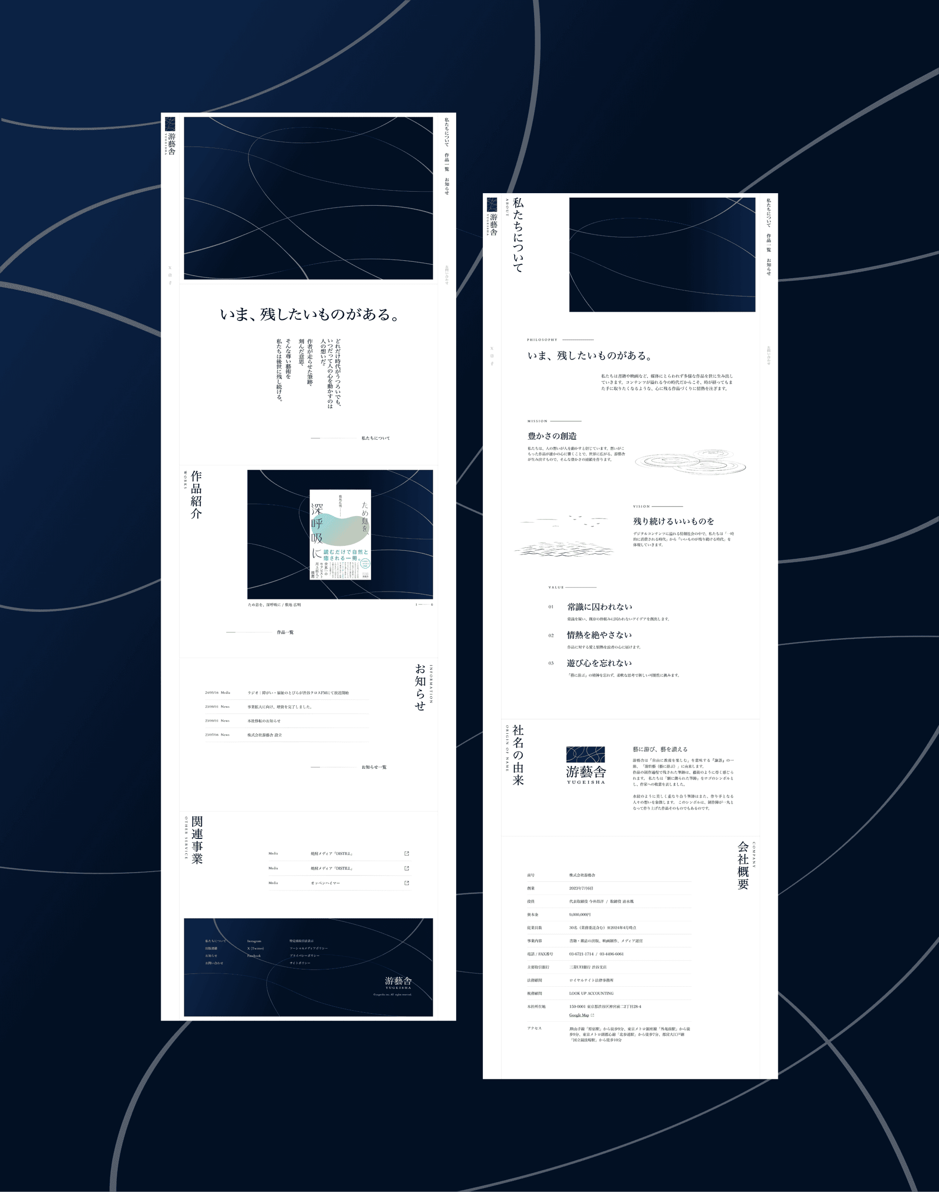
Corporate Site
Interactions That Convey Flow
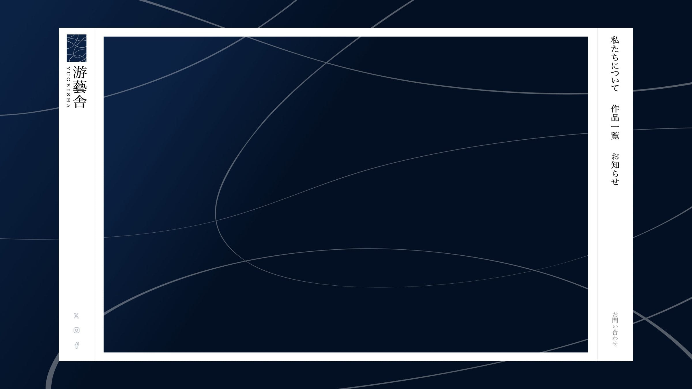
Echoing the visual identity, the corporate website was designed around the concept of “brushstrokes framed like a painting.” The motion of brushstrokes as they are drawn clearly communicates the story behind the symbol, while the flowing typography imparts a sense of dignity and assurance. Scrolling and hover interactions were carefully crafted to create a natural and pleasant flow.
Transforming Words into a Conveyable Brand
Using keywords gathered during our discussions, we crafted a statement that serves as the foundation of the brand’s image. Drawing inspiration from the sound of the company name and its origin in “游於藝,” we explored multiple directions, focusing on phrases with a flowing nuance.
We also proposed new mission and vision statements, refining them to better align with the brand’s personality and values.