(Menu)

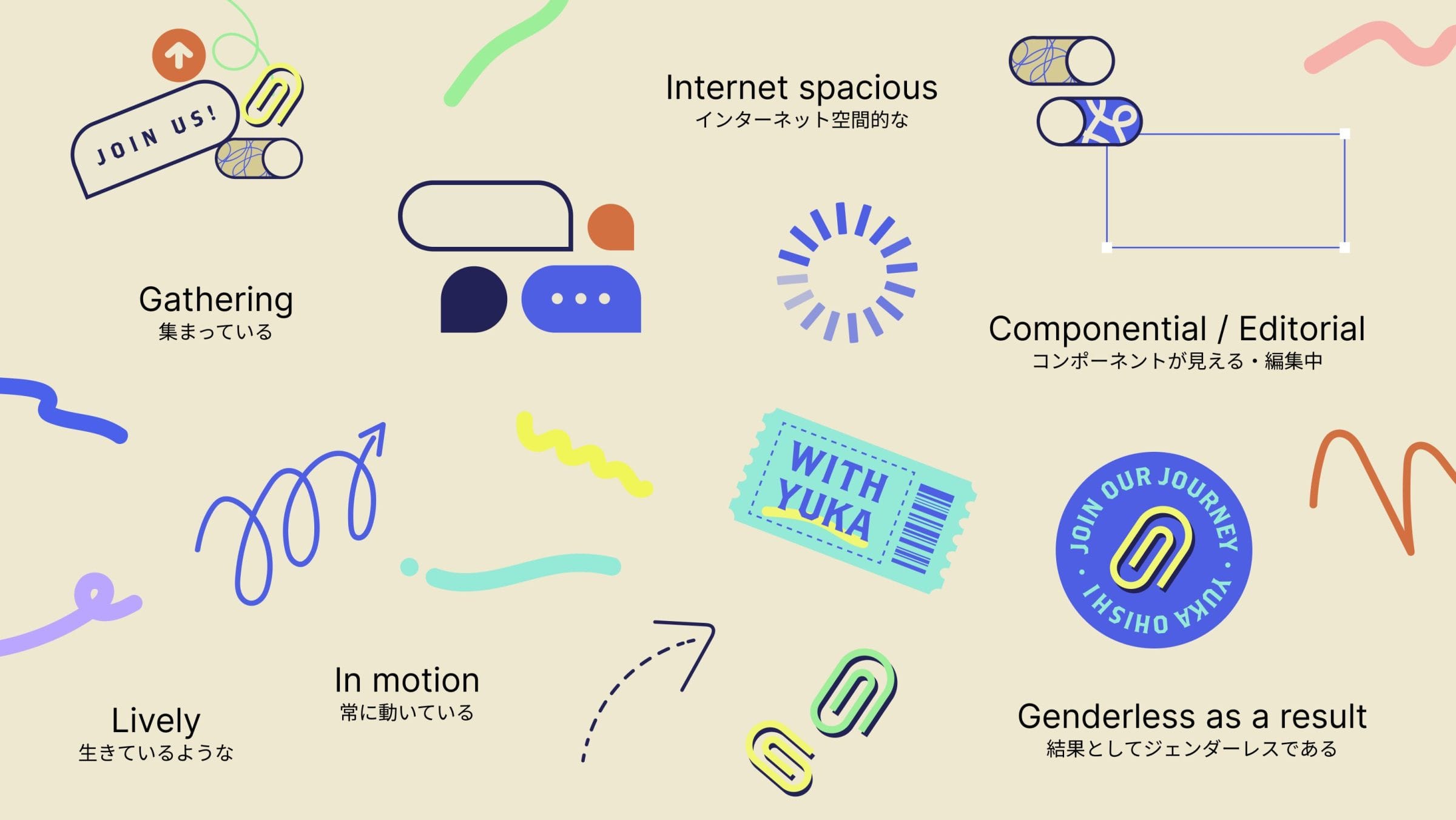
We began by creating a mood board that captured the unique qualities identified during our initial discussion with Yuka Ohishi. From this board, we extracted key words that encapsulated her essence.

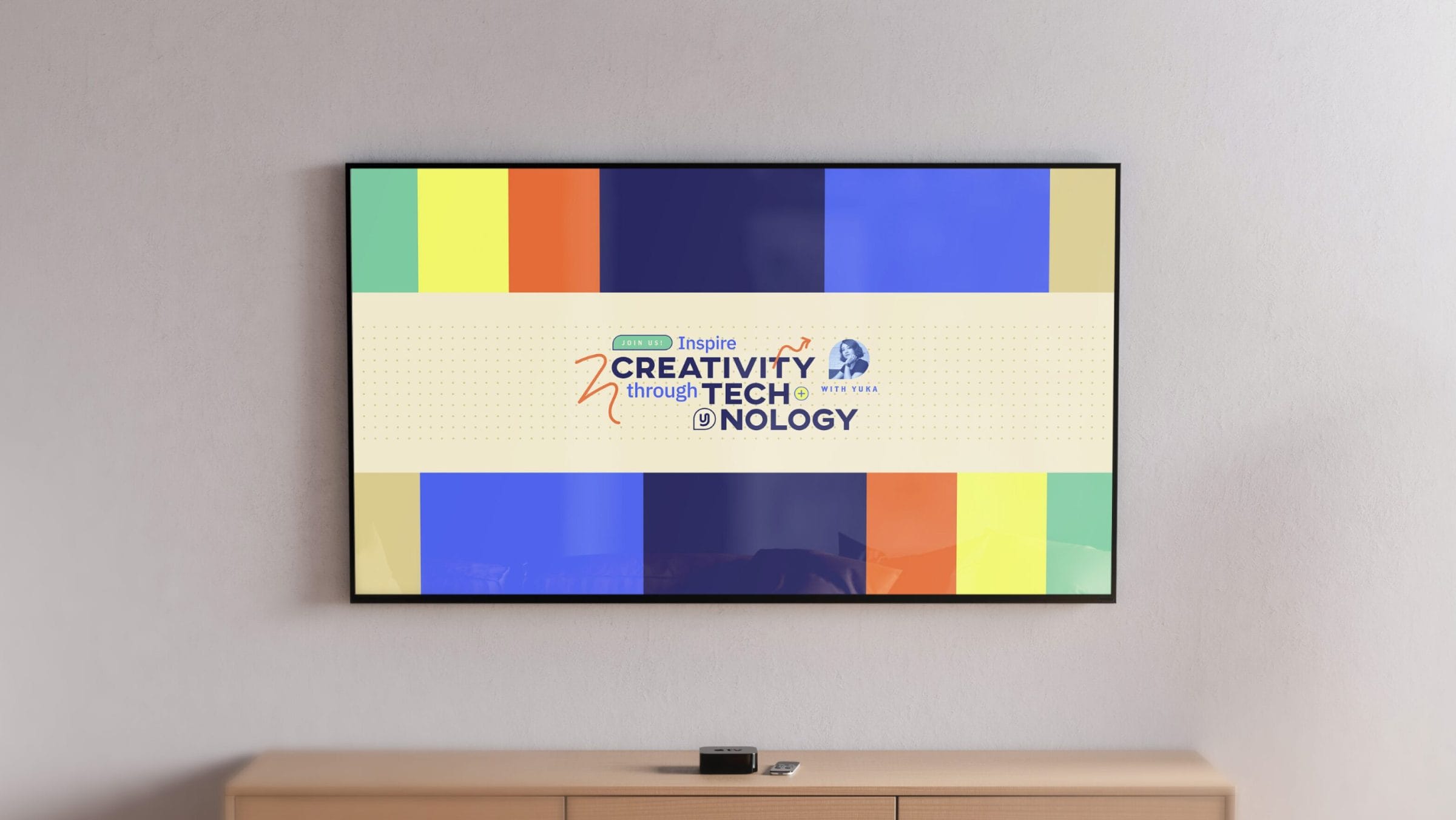
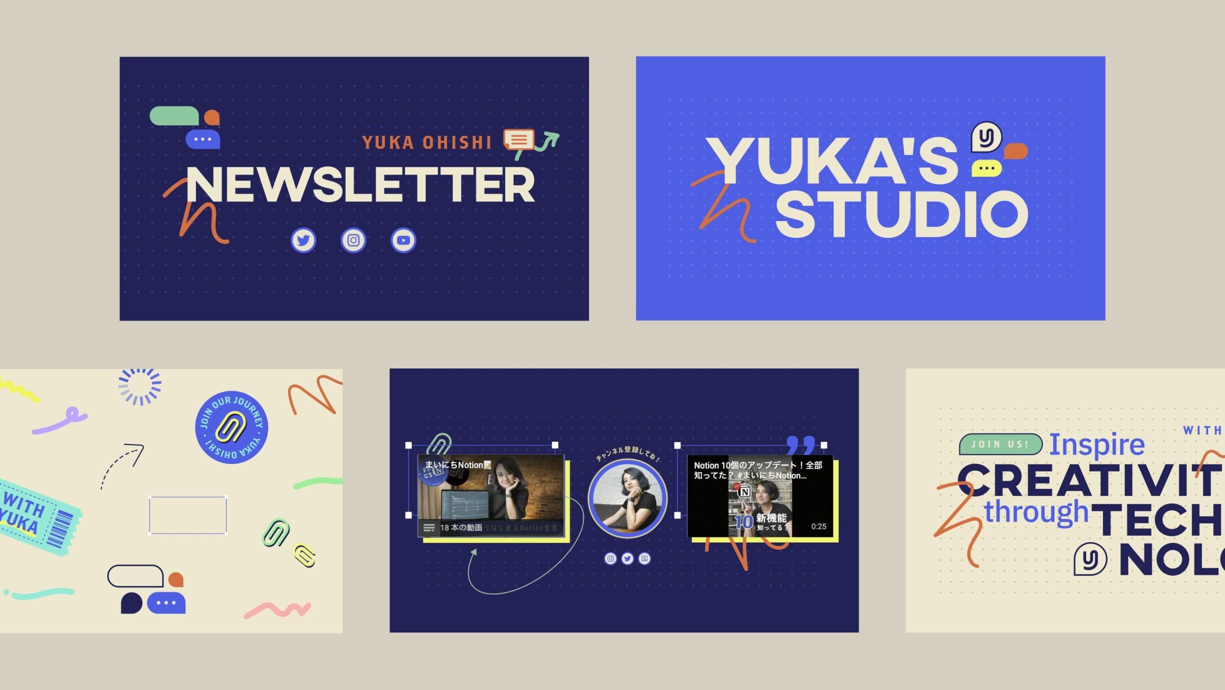
To ensure versatility across various platforms—such as videos, thumbnails, and business cards—we developed a flexible visual system with ample whitespace. Yuka’s “HUMAN TOUCH,” representing her commitment to supporting and fostering creativity, was conveyed through soft, hand-drawn lines.
Given that Yuka’s community comprises individuals eager to maximize their tools and express their creativity, we incorporated chat-style elements into the brand design. These elements, envisioned to animate dynamically in videos, reflect the lively and conversational nature of the community, symbolizing its vibrant activity.

