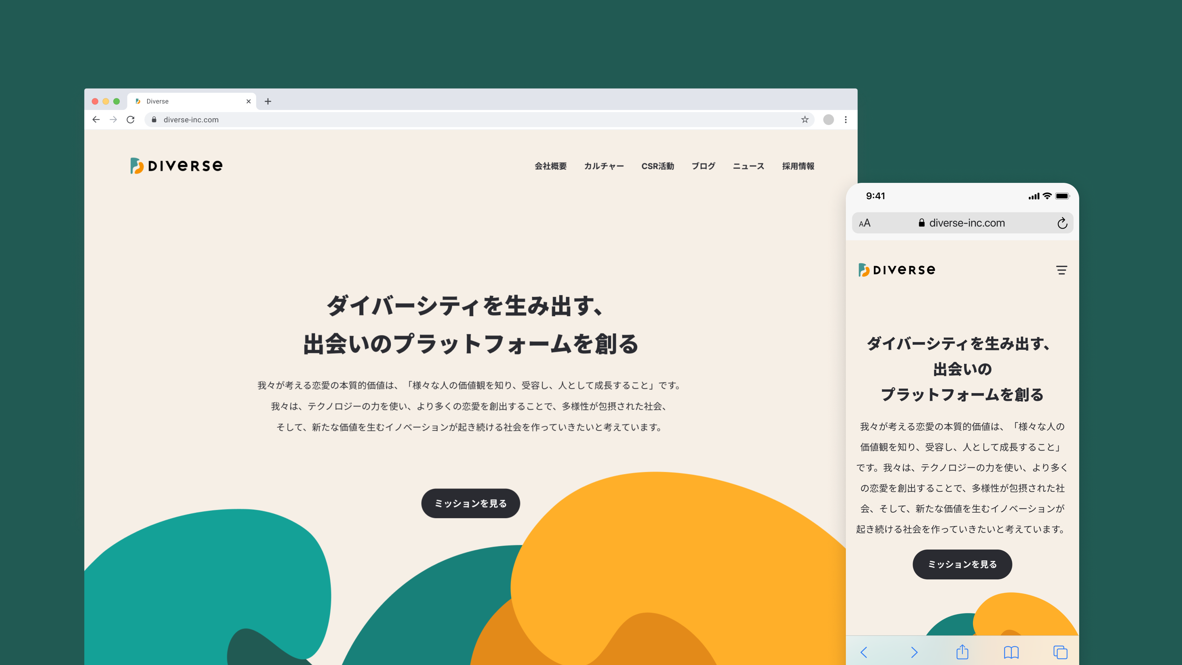
株式会社Diverseはマッチングアプリ等のサービスを運営する企業です。hicardは2020年5月より、社内のデザインチームを強化するためのデザインコンサルタントとしてアサインしています。CI/VIを含めたブランディングデザインも担当し、2022年9月にはコーポレートロゴとコーポレートサイトを刷新しました。
主にデザインチームのリード業務・クリエイティブのフィードバックレビュー・採用などを行い、チームビルディングに注力しています。
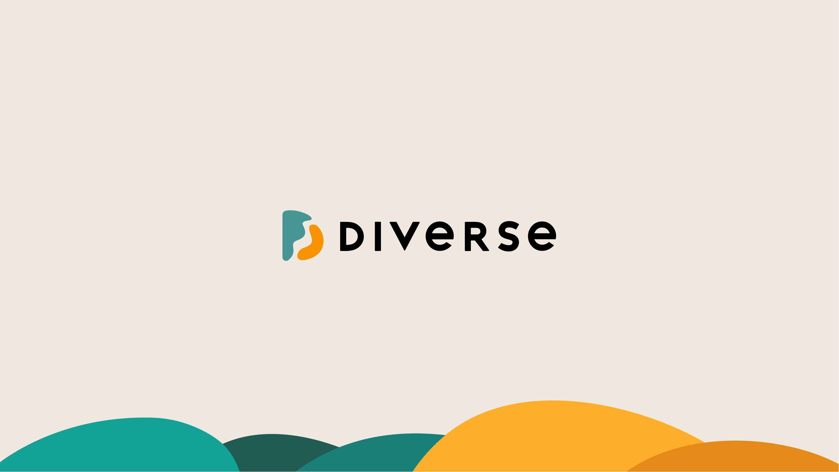
Logo thinking by Kristina
My thoughts of a new logo are that first of all it looks more gentle and smooth than previous one which gives it more friendly-like attitude.
Also it looks pretty modern and fresh. the shape of the logo was inspired by puzzles, connection, couple pieces and attraction.
I thought that the logo should show that the Diverse is mostly about finding your couple, soulmate.
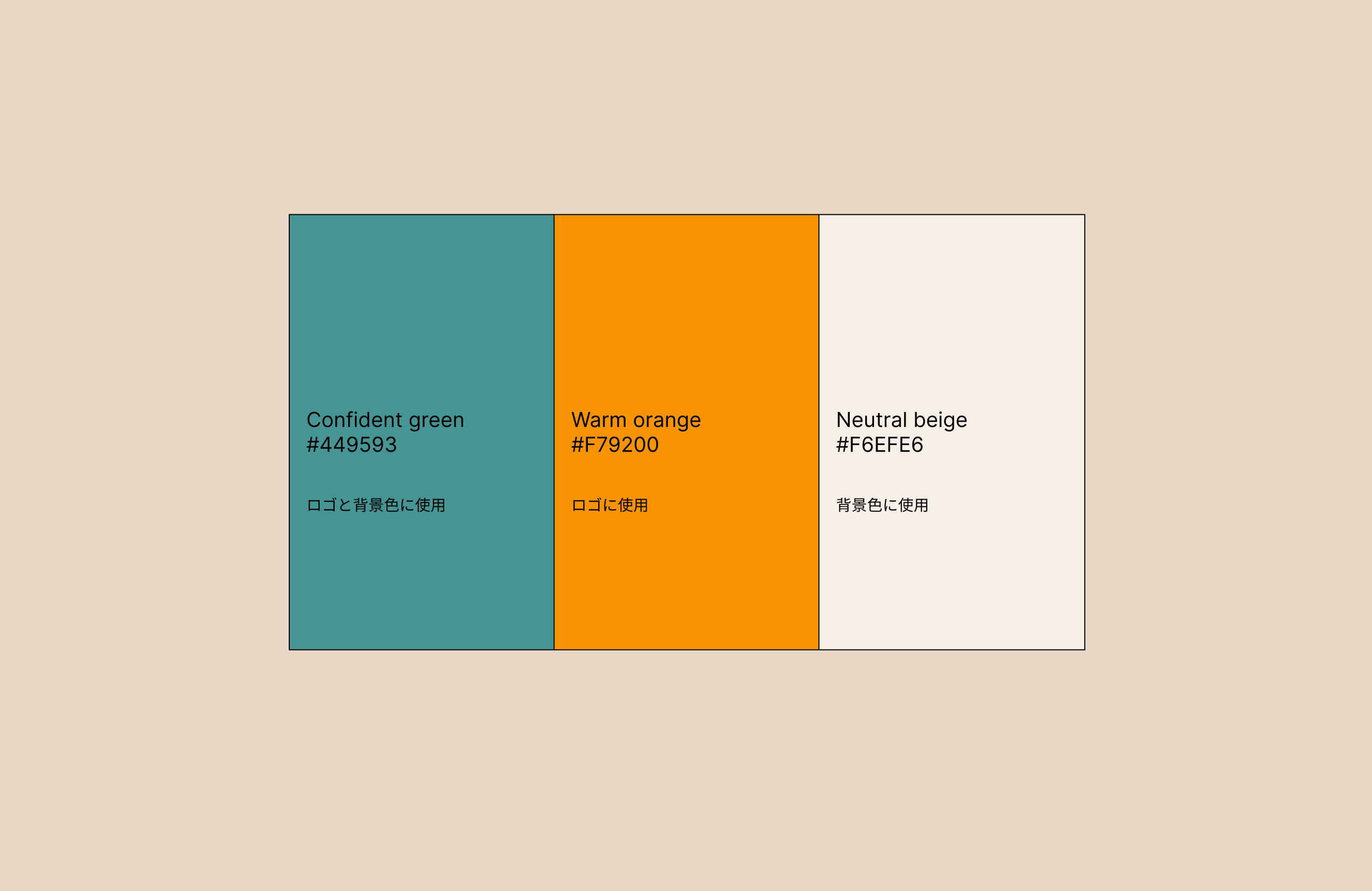
And the colors were made different to show the diversity. of course that was inspired by the name of the Diverse. the colors are different like different auras, energy, mood. that makes parallel with how people can be different and diverse but that doesn’t mean that they can’t be together. you never know. you have to try to find out if someone can fit you.
the process of the creation this logo was fun for me. first of all i have read all the information, vision, mission, all the description of the Diverse on their website.
and i made a lot of different variations of what i thought it can be in the end. i have talked with Diverse members to understand their preferences and their vision of it. Fortunately they told me a little bit of what they like the most.
And then i was trying to make more variations based on their opinion. the final version came to me accidentally when i wanted to create something that i would like myself, not for anyone but for me. but still i was keeping in mind all my experience, Diverse members recommendations and mood of the platform. and it came up that i made the final shape of the logo. and then the colors